Transform Your Designs into Digital Masterpieces
Seamless WordPress Conversion for Stunning, Responsive Websites
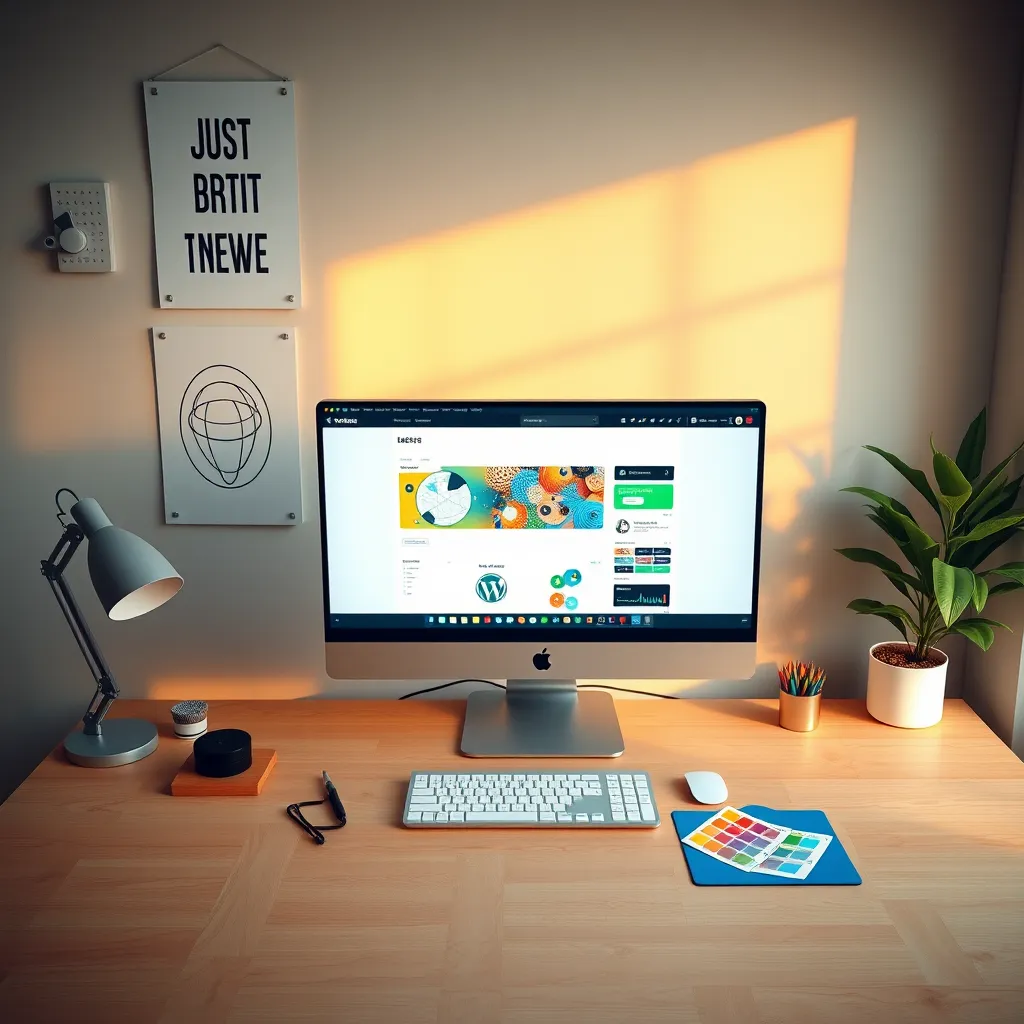
At VITSPRO, we specialize in providing a seamless transition from design to development. Our focus on mobile responsiveness and cross-browser compatibility ensures that your website not only looks great but functions flawlessly across all devices and browsers.
Bridging the Gap:
Ensuring a Seamless Transition from Design to Development

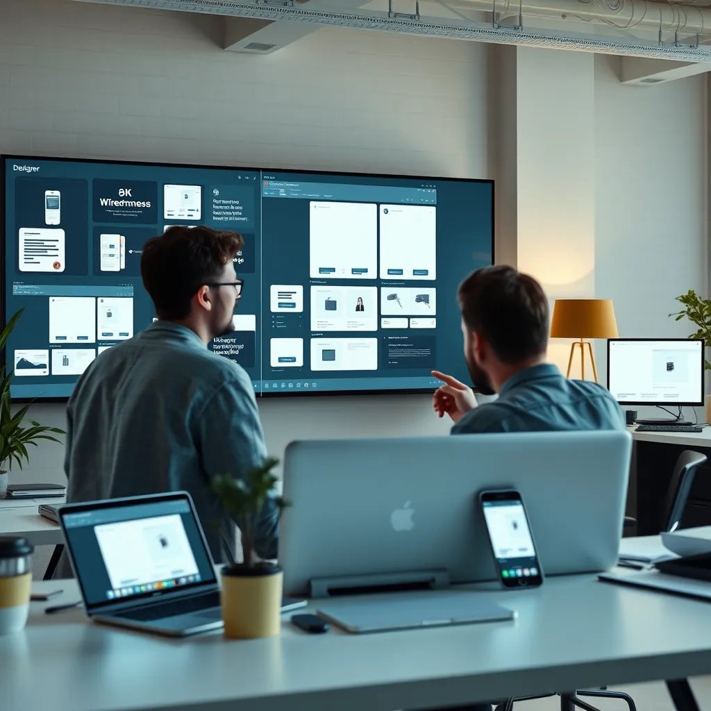
Collaborative Communication
Effective communication between designers and developers is essential for a smooth transition. Regular check-ins and collaborative tools can bridge gaps in understanding and prevent misinterpretations, ensuring that the final product adheres closely to the original vision.
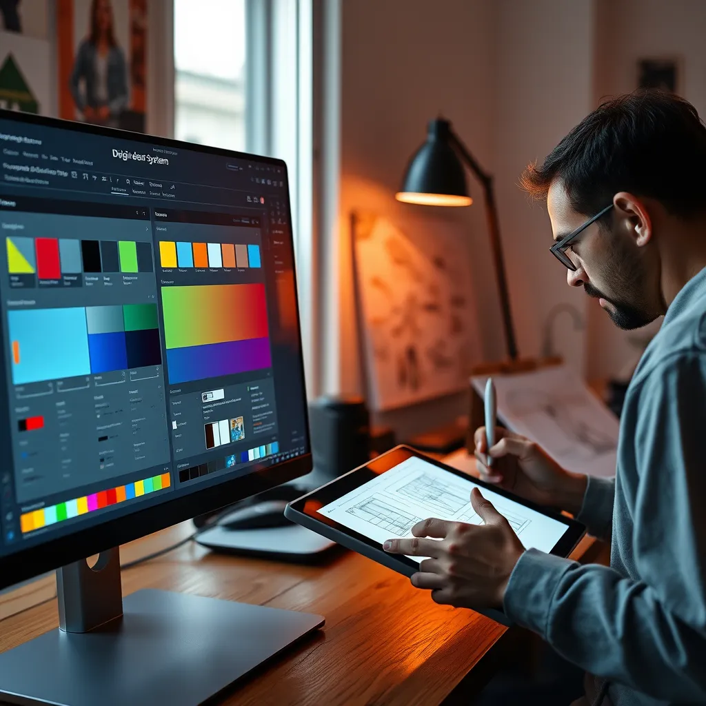
Utilizing Design Systems
Implementing a design system fosters consistency during development. Utilizing shared components, typography, and color palettes helps developers maintain design integrity, reducing the chances of errors and enhancing user experience across platforms.
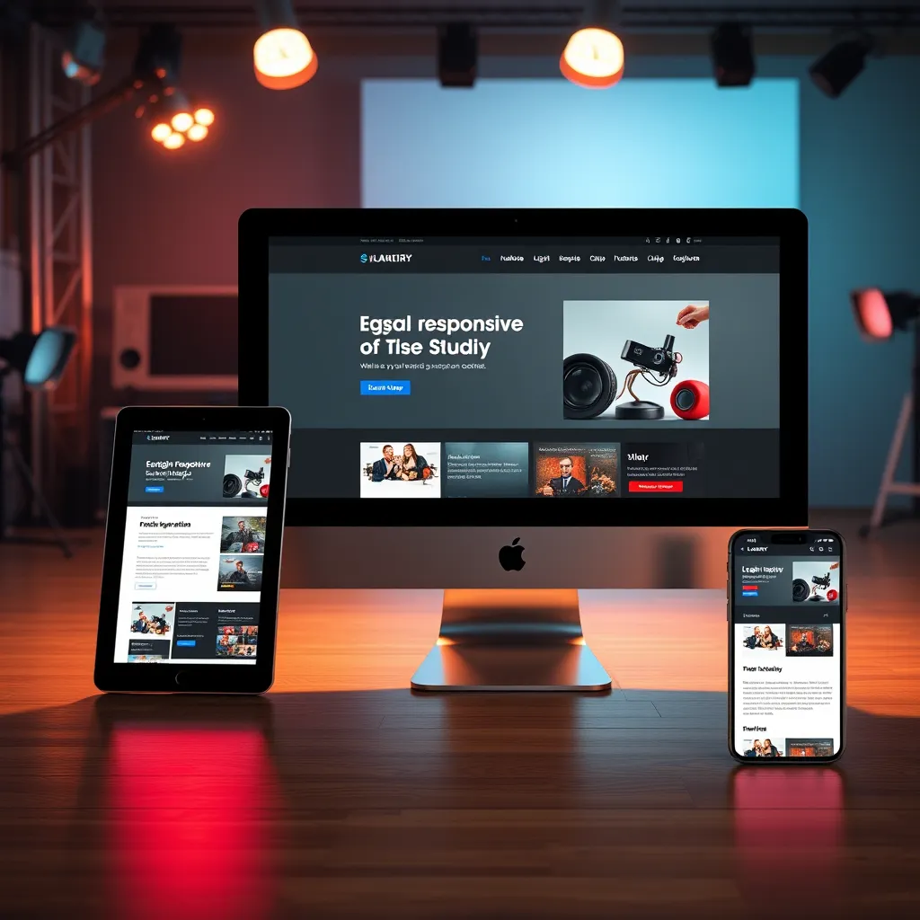
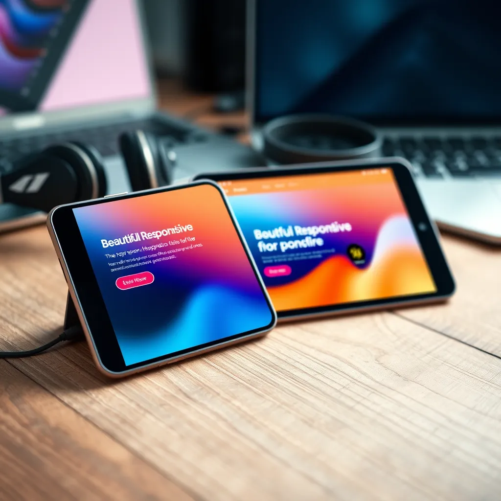
Responsive and Adaptive Design
Prioritizing mobile responsiveness in the design phase ensures a smooth user experience across devices. This consideration helps eliminate potential issues during development, leading to a more efficient process and timely project delivery.
Responsive Design and Cross-Browser Compatibility: The Key to Modern Web Success
Seamless Transition from Design to Development
Ensuring a smooth transition from design to development is crucial for maintaining the integrity of a website's responsive design. It helps retain aesthetic qualities while enhancing functionality across various devices, leading to a better user experience.


Mobile Responsiveness
Mobile responsiveness is vital in today's digital landscape, ensuring that websites perform optimally on smartphones and tablets. This adaptability enhances user engagement and retention by providing seamless navigation and quick load times on all devices.
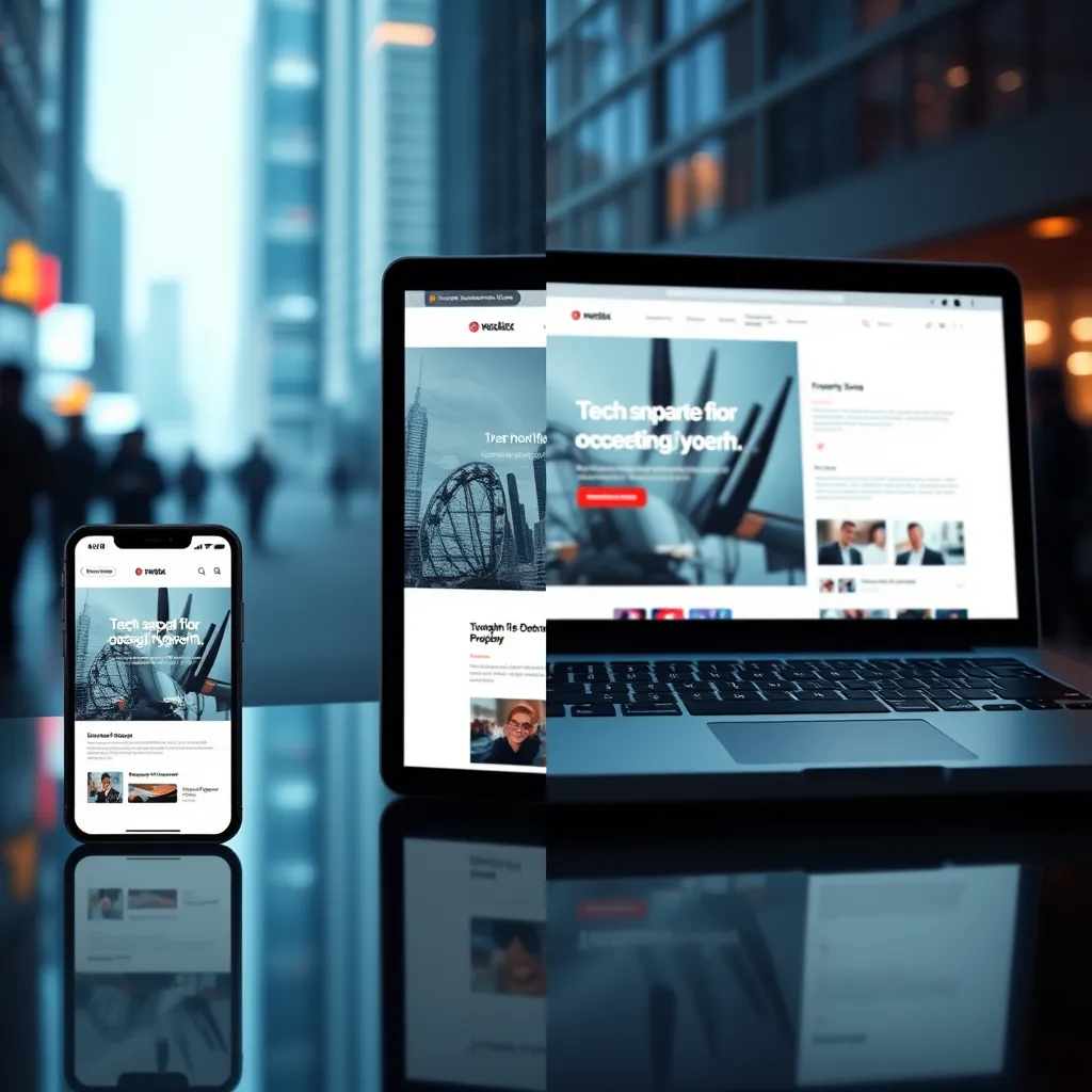
Cross-Browser Compatibility
Cross-browser compatibility guarantees that a website appears and functions consistently across different browsers. This universality is essential for reaching a broader audience, preventing technical issues that could deter users from engaging with the content.

From Concept to Code: Mastering Mobile Responsiveness and Browser Compatibility
Seamless Transition from Design to Development
A proficient transition from design to development ensures that visual elements maintain their integrity across platforms, facilitating a unified user experience. Collaborating closely with developers during the design phase is crucial for success.
Mobile Responsiveness: A Must-Have
In an era dominated by mobile usage, ensuring that websites are mobile-responsive is essential. This involves fluid grids, flexible images, and CSS media queries to deliver a seamless experience across various screen sizes.

Achieving Cross-Browser Compatibility
Cross-browser compatibility ensures that web applications function consistently across various browsers. Comprehensive testing and employing standardized web technologies help to mitigate discrepancies in performance and appearance.
VITSPRO Services
Design to Development Transition
Experience a seamless conversion from design files to WordPress themes.
Mobile Responsiveness Optimization
Ensure your website adapts flawlessly across all devices.
Cross-Browser Compatibility Testing
Guarantee your site looks great in any browser.

.png)
.png)
.png)
.png)
.png)
.png)
What Our Customers Say About VITSPRO

VITSPRO transformed our design into a stunning WordPress site flawlessly. Their attention to detail and professionalism is unmatched!
Fatima

I was amazed at how quickly VITSPRO brought my vision to life. The conversion process was seamless and the final result exceeded my expectations.
Mariam

Working with VITSPRO was a game-changer for our business. Their expertise in design to WordPress conversion has made our site not only beautiful but also functional.
Afzal
Transform your stunning designs into a fully functional WordPress site with VITSPRO today!
VITSPRO
© Copyright 2024 VITS PRO
 Powered By VITSPRO